Land Art

Standard

Land Art

Land art is a movement that began in the late 60s in the United States. This art form is created in nature and links art and its landscape. Rather than typical art that is created and put in a landscape, land art uses that landscape as the art. The natural materials used to create this kind of art is often left to take its natural course such as erosion. “Land art is to be understood as an artistic protest against the perceived artificiality, plastic aesthetics and ruthless commercialization of art.”

Artist

Robert Smithson is an artist who is very well known for his work in this movement. He often created pieces using earth and rocks combine with other materials such as glass. Here is an example of one of his works:

Book

For this book entry I used an ad I found that said “When does nature surprise” to play off of the idea of nature. I found leaves similar to the ones in the picture and placed them on the ad. I also collected twigs, grass and more leaves to add the collection. I attached everything to the ad letting the words peak through.

20111212-105055.jpg

20111212-105127.jpg

20111212-105200.jpg

Mail Art

Standard

Mail Art

Mail Art is a cultural movement that involves sending mail through the international postal system. This mail consists of visual art, music, sound, poetry, etc. Mail art is thought of as an “Experience” with roots as far back as Cleopatra’s time and is found in a number of forms including, more recently, internet mail. Mailartists decorate envelops, design stamps and personalize stationary making the means on which a message is delivered more valuable than the content within.

Artist

György Galántai is a Hungarian artist. In the late 70s he started a correspondence with other artists around the world, joining the mail art movement. In 1978, he created an archive for these correspondences and other documents which he collected on Hungarian neo-avantgarde movements and founded the “Artpool Art Research Center” which became one of the largest archives of mail art, artistamp and art journal collections.

Book

I folded a magazine ad into the shape of an envelop to demonstrate mail art. I cut up pieces to create the shape in the back and a collage effect. I also added a stamp that I cut out of the magazine and folded up another ad like a letter and placed it inside.

20111212-092640.jpg

20111212-092626.jpg

20111212-092700.jpg  20111212-092730.jpg

Superflat

Standard

Superflat

Superflat is an art movement that was founded by postmodernist Takashi Murakami. This movement found inspiration in anime and seeks to comment on post-war Japanese culture, criticizing the “otaku lifestyle, consumerism, and related issues”. Superflat emerged as a response to the homogenization of Japanese art and media and its broad nature allows it to encompass a wide range of subjects.

Artist

Mahomi Kunikata is an artist who uses the narrative qualities of Japanese comics as a means of creating deep, insightful, original works of art. Kunikata’s work is emotional and sexual often reflecting personal issues such as abandonment, masochism, and depression.

Book

To demonstrate superflat in my book I took inspiration from examples I found with women posed in front of animated backgrounds. I cut one of the models out of the magazine and pasted the cutout on a page that I decorated in a similar colorful, animated, manner.

20111212-095159.jpg

20111212-095207.jpg

Relational Aesthetics

Standard

Relational Aesthetics

Relational Aesthetics is a mode of fine art that is based off of human relations and social context as a whole rather than the individual private sphere. Art that falls in this category works with the changing mindset of society over time. As culture changes, this art adapts and takes its “point of departure in the changing mental space opened by the internet”. As an art form, these works allow people to come together and collectively participate in an activity.

Artist

Philippe Parreno is an artist and filmmaker from Algeria who currently lives in Paris, France. His work is primarily focused on “the interrogation of the nature of an image, as well as the modes of its exhibition.”

Book

For this week’s book application, I decided to recreate an activity that I used to participate in when I was younger. My friends and I used to dress up little paper dolls in different outfit cutouts. I found an as in my magazine with a model in her bra and underwear which is how the paper dolls used to come and was inspired so I searched around the rest of the magazine for outfits that could fit her. I cut out a number of outfits and took pictures of the outfits on the model. I also created a pocket in the magazine to store the outfits in.

                                          20111212-092449.jpg   20111212-092500.jpg  20111212-092509.jpg

20111212-092533.jpg   20111212-092542.jpg

20111212-092552.jpg

Site Specific Art

Standard

Site Specific Art

Site-specific art is art that is created to be in a specific place. The artwork generally reflects that location that it is in, in some form, and is usually permanently attached to that location. This type of art emerged in the 1970s and was first used by a number of young sculptures. Site-specific art can be either indoor or outdoor and varies accordingly.

Artist

Luna Nera is a group of international artists who work together to make site-specific artworks. The organization was founded in 1997 and since then they have exhibited their work in a wide range of venues. The group mainly creates works that respond to urban sites that have fallen into “dereliction”.

Book

I decided to use the spine of my book at the “site” because it is the foundation of the magazine so it is what I consider to be the most permanent part of the book. I created a landscape scene on the spine complete with green grass, blue sky, white glittery clouds, and a flower.

20111212-092359.jpg

20111212-092408.jpg

Arte Povera

Standard

Arte Povera

Originating with a group of Italian artists, Art Povera involves the “dichotomy between art and life, mainly through the creation of happenings and sculptures made from everyday materials.” This style of art contrasted the traditional role of art as a means of reflecting reality and is characterized by contradictions and the “juxtapositions of apparently unconnected objects”. Art Povera is often created using less than glamorous materials and was linked to political radicalism of the contemporary times. A major focus of art povera artists was in creating a physical interaction between the viewer and the work of art.

Artist

Michelangelo Pistoletto is an Italian artist who began 1960s attaching life-size images of people to mirrored surfaces so that the spectators’ reflections became part of the piece.

Book

To demonstrate arte povera in my book, I decided to take an approach similar to Michelangelo Pistoletto’s mirror display. I decided to make the audience a part of the work by incorporating a mirror into a Versace advertisement. I cut the model’s head out and attached a mirror to the back side of the page so that when you look at the page your face is reflected on the models body.

20111212-092253.jpg  20111212-092303.jpg

Art Intervention

Standard


Art Intervention

This technique involves interacting with a previously existing work, audience or space to express a position. This type of are is conceptual and many bring to attention the  fine line between art intervention and vandalism. Art intervention pieces often challenge or comment on the theme or implications of the original work.

Artist

Art intervention can be seen in the work of El Crudo, an artist from from Valparaiso, Chile. In the example below, he took a painting of multiple childhood icons, including Ronald McDonald and Mickey Mouse, and destroyed the pictures of them. The text is translated as “shooting target/the childhood on attack” and speaks to the politics of Chilean society.

Book entry

To demonstrate this technique in my book, I chose to alter a perfume ad. The orinal DKNY add consisted of a beautiful blonde girl holding a green apple with a number of other green apples in the foreground of the photo along with the perfume bottle which is shaped like an apple. The text reads “BE DELICIOUS”. I found a photo of the wicked witch from Snow White and replace the beautiful face of the model with her evil, ugly face. I also painted the apple in her hand red like the poisonous apple in the movie “Snow White” and added red to the text. These alterations intended to portray the sometimes evil, poisonous nature of seduction and sexuality. This perfume is supposed to make women “delicious” and sexy but the contradiction of this haggard old woman’s face forces the audience to relate this perfume and the effect that it has to evil and danger (red).

20111024-120357.jpg

Project 2- Chair + Shelter

Standard

Background

The assignment was to create a chair that was also a shelter. At first, I was completely discouraged by the thought of this; I don’t use power tools and I am not an architect. I had no idea where to start with my design until my professor suggested that I start with what I wanted it to look like in the end and from there I sketched and scribbled until finally I had a general idea of what I wanted to do. I did not want to go to the store to buy supplies for this project, I wanted to create something useful out of recycled materials, something that anyone could put together using scraps they found on the street. I started exploring the idea of homelessness and scavenging. What could a homeless person find while wondering the streets? People throw out so many things that may seem too old or too worn but could still effectively serve a different purpose and I wanted to incorporate these things into my design. I wanted to show the audience that one man’s trash really is another man’s treasure.

I wanted to create something portable and reasonably comfortable that provided protection from the elements. I decided that I wanted my chair to fold out into a bed that could be easily covered in the case of rain or snow. I also wanted some kind of storage space so that one could pick everything up and move it from place to place. I decided that using a dresser for a base would be a good place to start.

Process

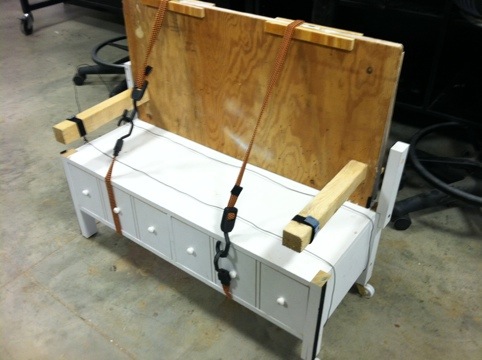
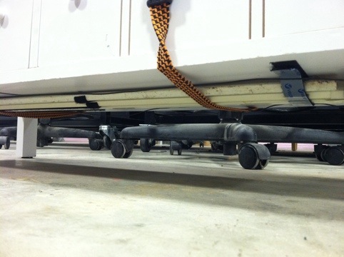
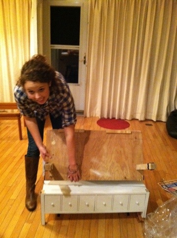
I began with a dresser drawer that I found at Good Will. I took off the sides of the drawer so that the top was level and changed the lengths of the legs on the bottom so that I was able to attach wheels to both of the legs on one side. I found two pieces of wood in my shed that were about the width of the drawer and decided that they would be good to use for the bed portion of my shelter. I bought hinges (unfortunately, I wasn’t able to get away with finding everything) and sought to attach the two pieces of wood to the drawer. This is where I began to run into some complications.

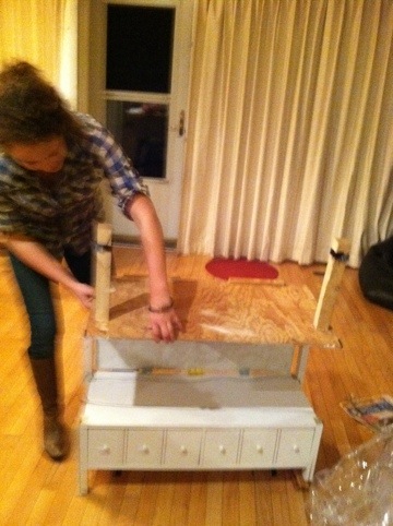
I found that the pieces of wood that I was using were too thin to support the screws that came with the hinges I purchased so I had to cut additional smaller strips of wood and attached them to the larger pieces with wood glue in order to make the wood thick enough to screw the hinges in to. After I finally attached the two pieces of wood together I faced the challenge of attaching this unit to the drawer. After some maneuvering and two failed attempts I was able to make it work. At this point I had already created and attached a set of foldable legs to one of the large pieces of wood to support the bed but after trying to unfold the unit, I realized that I would need much more support if I wanted to make this part functional. I managed to find a think rectangular piece of wood outside that I cut into two legs (which I was conveniently able to make serve as arm rests as well!). I used a hot glue gun and screws to attach the legs to the shelter. Another problem I had to solve was how to make the backrest of the chair stay up when someone leaned back on it. I ended up attaching some scrap wood that I had cut off of the chair at the beginning, to either side of the backrest and drilling holes in them that were big enough to slide a metal post into that would sit in between the folded wood and support it from falling straight back when pressure was applied.

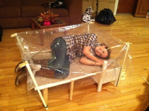
Once I finished constructing the shelter and made sure that it was stable enough to sit and lay on, I had to figure out how I could provide protection from the elements. I found some old curtain rods in my basement and attached a piece of Velcro to the inside of each one and to the outside corners of my unfolded shelter. These curtain rods would serve as the support for the shelter’s “roof”. I decided that it would be best to use a clear shower curtain as the cover because it is light, water proof and small enough to fit into the storage drawers. I attached the corners of the shower curtain to each of the curtain rods using clothespins and voila!, I had created an instant sun roof for my shelter.

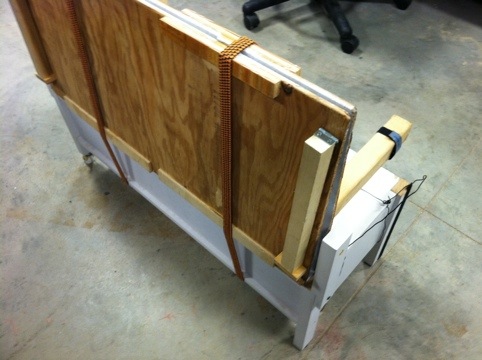
I used wire to create a handle for the shelter so that you could lift up one side and pull the whole unit which moved effortlessly on its wheels, somewhat like a suitcase. The bungee cords were used for transportation purposes, to keep the pieces of the shelter from moving around too much and to keep the drawers from opening. The bungee cords could then be used it its chair form to secure the backrest even further. I also attached two pieces of Velvro to the bottom of the drawer to act as a holder for the curtain rods when they were not in use. I found a rug at Good Will that could be stored in one of the drawers that I used as a cushion for the chair and bed.

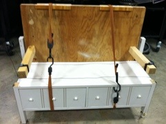
Here is my shelter in its portable form:

20111020-235602.jpg  20111020-235652.jpg  20111020-235709.jpg  20111020-235728.jpg

Here is my shelter in its functional form:

20111020-235833.jpg  20111020-235903.jpg

20111020-235928.jpg  20111020-235937.jpg 20111021-000022.jpg  20111021-000045.jpg

20111021-000100.jpg20111021-000004.jpg

Estrangement (Verfremdungseffekt)

Standard

Verfremdungseffekt is known as the distancing or alienation effect. In order to create distance the author must act as if the three walls surrounding them are the only walls that exist and that there is never a fourth one so that the audience no longer feels like the unseen spectator.

Artist 

Torgeir Ensrud is an American artist that uses estrangement in the digital arts. Here is an example of his work:

Book Entry

I focused on creating distance between the audience and the image in my portrayal of the estrangement technique. I chose to work with a Nike ad that says “FREE YOURSELF” with a photo of a woman who looked like she was breaking free from something. I used a piece of black airy fabric to create distance and to create the feeling that she is still restricted. I stapled the fabric on to the page in a bar like pattern to further create this restricted feeling.

20111017-001342.jpg

20111017-001352.jpg

Intertexuality

Standard

 Intertexuality

Intertextuality involves the evolution of meaning and the way that everything in art stems from something else. It is the shaping of a text’s meaning by another text and in art it is the way that perceptions and understanding create the meaning in a piece.

Artist

This theory can be best understood through the works of a number of artists, particularly in reference to the famous piece “American Gothic” and the way that many people have skewed/altered the originally image to portray a specific message. Here is an example of how “American Gothic” was used to portray America as a militaristic society:

Book Entry

To demonstrate this technique I used an advertisement for Pandora bracelets. I wanted to play with the idea of changed meaning so I decided to use paint to add words and phrases that would change the meaning of the ad. Generally, jewelry is depicted as something that women love to receive, something that makes them happy and that is the exact message that this Pandora ad was trying to get across. I painted the words “Material Love” across the top of the ad and connected the word world vertically to the end of material so that it could also read “Material World”. I also went through and highlighted words in the ad that indicated that buying a Pandora bracelet could basically buy someone love.

20111010-232927.jpg